After our Route 66 trip in April, I found it difficult to jump back into the rhythm of painting. I think I needed a slower start. My biggest focus this month: finishing a commission for one of my oldest and sunniest friends.
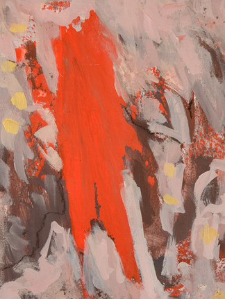
The two paintings, Golden I and Golden II, were hands-on learning through practice.

These commissions ended up feeling like a gift to me as an artist. My friend asked me to work within a limited palette of red, gold, black, and white, and the constraint became bumper lanes for experimentation.
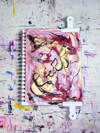
I started the process off with initial layers of black and white spray paint, then spent time in my sketchbook exploring how the gold paint behaved. It was my first serious experience painting with gold, and I learned that it comes alive differently depending on what lies underneath it. Raw sienna created a warmth and richness that white and black couldn't quite achieve.
Working on a larger scale, layering acrylic paint, water-soluble pastel, pencil marks, and mixed media elements, reminded me how much I enjoy building paintings through discovery and intuition.
One of the highlights of the process was visiting my friend's home before finishing the work. Being able to see the space where the paintings would live helped me imagine them more clearly and make decisions with intention. As I write this, the paintings are receiving their final coats of fixative and varnish before making the journey across the country to their new home.
Three Galleries and Counting


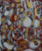
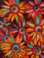
While I was planning this abstract studio artist update, I learned that Triple Vision I, II, and III were accepted into the juried Summer in the City exhibition at the Cumming Arts Center. These smaller acrylic paintings celebrate vivid blooms and bright summer energy, and I'm thrilled to see them exhibited throughout June and July.
Preparing them for display gave me another opportunity to experiment, this time with framing. I chose white oak floating frames, a departure from the black and metallic frames I've used previously. The warmth of the wood feels increasingly aligned with the direction I'm moving aesthetically.
Meanwhile, Fall Flowers spent the month on display with the Macon Arts Alliance.
One of my goals this year is to consistently put my work out into the world and seeing that happen feels encouraging and validating.
Learning to See Through an Interior Designer's Eyes
As I wrap up the commissions, I’m turning my focus to the relationship between art and interiors.
I have started paying closer attention to the designers and spaces I admire, wondering how artwork functions within a room rather than as a standalone object. Instead of asking, "What painting do I want to make?" I'm thinking, "What feeling does a space need?"
I'm looking at new color combinations, more restraint in some places, and more intentionality in others.
I FINALLY found a room mockup tool that looks promising! More to come on that.
Looking Ahead to June | Abstract Artist Studio Update
I've long been curious about oils but have never given them a go. Earlier this month, I made a trip to Blick and came home with a starter set of paints and paper. I want to make some mistakes, learn how the paint moves, how the colors behave, how slowly it dries, and what possibilities it opens.
…and if I don’t get to it, so be it!
Forty

As I write this, my fortieth birthday has just passed. I feel better going into forty than I did going into thirty.
At thirty, I had two children under three, a full time and then some job, was exhausted, overwhelmed, and carrying a lot of anxiety. I was working at an agency and dreaming about moving in-house to “client-side”.
Forty feels different; I’m still anxious. I still think about my body, aging, and the changes that have come with time. But this time, I feel more confident, more grounded, and more certain of who I am.
I’ve had 40 beautiful years on this planet. And now, I get to keep on creating!